What are the best recruitment website designs in 2023?
If you’re about to start on a new website project, learning from other recruitment agencies’ work can be helpful. After all, how will you know what the best recruitment websites look like if you haven’t seen any examples?
To offer some ideas, we’ve gathered recruitment website design inspiration from the best recruitment websites today. In this guide, we’ll take a closer look at the features and layout that make these websites work, then offer some suggestions on how to apply good design principles to your own website.
Read on to learn from some recruitment website success stories.
What makes a standout recruitment website design?
Examples of Best Recruitment Websites
To give a better idea of what good recruitment website design principles look like in action, we’ve gone into more detail on this list of some of the best recruitment websites.
Read on for an overview of what makes each of these websites work, plus a few takeaways you might use in your own recruitment website design.
1. Chandler Macleod
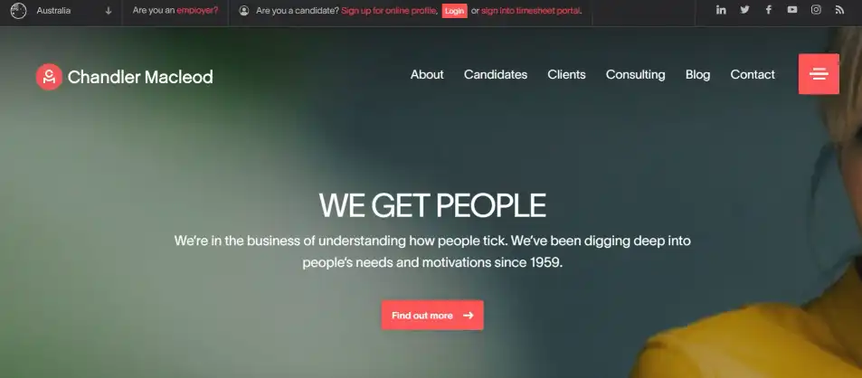
The first thing that pops out on Chandler Macleod’s website is a simple, consistent design. The colour palette is limited, and the website mostly sticks to a single font. The design doesn’t distract from the website’s function.
From the moment a user lands on the home page, the eye is drawn to Chandler Macleod’s bold tagline and a job search bar. From a potential candidate’s perspective, it’s simple to get looking for their next role right away.
It's also easy to navigate. Chandler Macleod offers a variety of services, and it would be easy for a website visitor to get lost. Above the fold, four options explain the agency’s services. The links to these subpages are easy to spot and will funnel visitors towards what they want to see. If you’re looking for recruitment design inspiration, this is as good a place to start.
Visit Chandler Macleod’s website here.
What can I apply to my recruitment site?
Limit website palette to 3-5 colours
Sort services and specialisms into subpages
Put the job search front and centre
2. Blu Digital
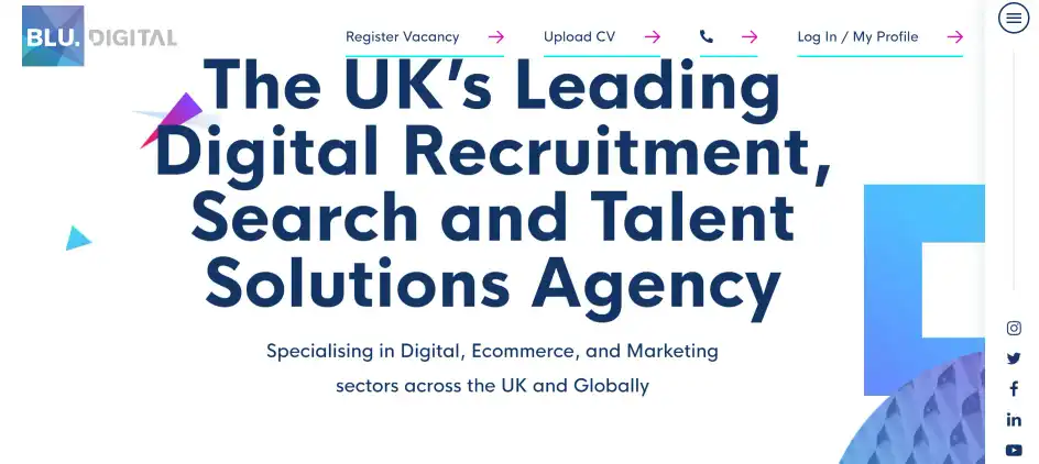
Blu Digital’s website has an instantly recognisable visual identity. Their logo is made of triangular fragments and a blue-to-red colour scheme. These elements are repeated throughout the website to keep a coherent design.
To break up the brightly coloured and simple shapes, the website designers added in graphics with 3D texture. This shows that sticking to one theme doesn’t have to be limiting. And this fun visual style is perfectly suited to an agency that specialises in creative, digital, and marketing roles.
The layout of the main page makes the CTAs unmistakeable. First the large font and streamlined design let the eye wander right to the agency’s specialisms. Reducing “friction” this way encourages visitors to click into the specialism page, where they’re directed to a large CTA download button.
Blu Digital’s website is deceptively simple: the entire layout encourages visitors to move down the funnel.
Visit Blu Digital’s website here.
What can I learn for my recruitment site?
Push the boundaries of the website design theme
Build around CTAs
“Simple” design can be the best choice
3. Maxxima Group
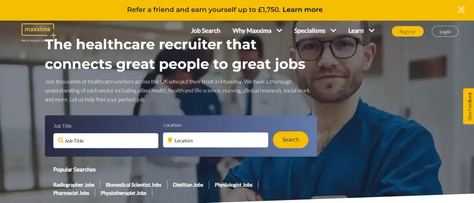
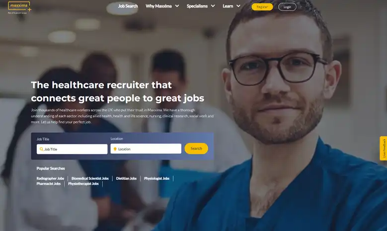
Maxxima Group’s website excels at putting key information above the fold. Their job search is up front, and right underneath there are links to the agency’s most popular searches. The website’s design optimises for as few clicks as possible and makes it simpler for talent to find roles.
Maxxima Group’s website also includes a table of roles that they recruit for, with links to discipline pages (like Audiology, Nursing, Radiography, etc).
This is a smart choice for two reasons. One, listing out these roles as internal links can improve the website’s SEO ranking. Two, breaking down roles into disciplines makes sorting through titles to find the right job easy for candidates. This is why we regard this as a best recruitment website.
Maxxima Group is a large recruitment agency working in the medical industry, so the amount of information on their website could easily overwhelm. But with user-friendly design, they’ve leveraged their website to put candidates first.
Visit Maxxima's website here.
What can I apply to my recruitment site?
Optimise for SEO everywhere
Make the job search simple
Design with candidates in mind
4. Foodchain Recruitment
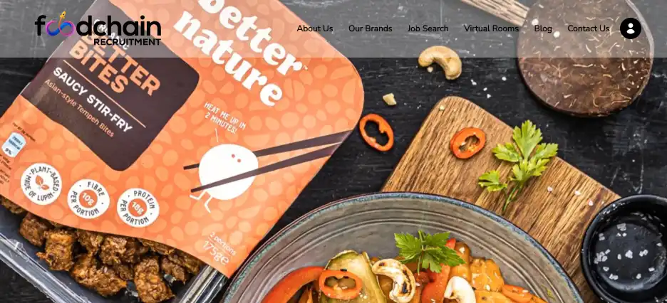
Foodchain Recruitment has creatively involved video on their homepage. As food and beverage recruitment specialists they work with some very impressive brands and they have intertwined some of these names with the video that welcomes you as you land on the site. The video is as effective on your mobile device as it is on your desktop PC meaning consistency of creative experience. As a professional considering their next move, job search is only a click away, whilst Virtual Rooms with account managers with specific brands can be used for both hiring manager and interested job seeker. With its attractive, seamless and uncluttered design, it stands out and offers recruitment website design inspiration.
For those interested in information about the growth of Foodchain, that can be found at the click of a link.
What can I apply to my recruitment site?
Using video without compromising visitor experience
Virtual meetings engage those interacting with the team at Foodchain
Clean, crisp, engaging design
5. Sphere Digital Recruitment
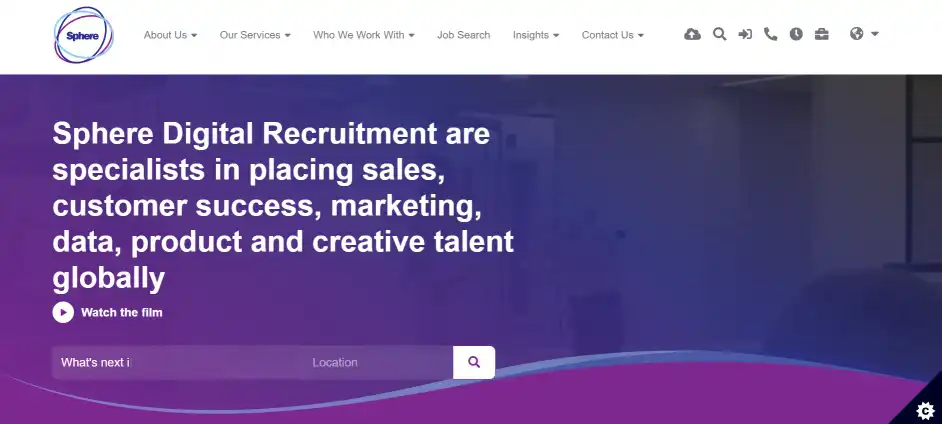
Sphere Digital Recruitment chose to have tabs on the right side of their homepage. This is a unique choice, but the fact that they stand out is what makes them effective. These tabs (Search Jobs / Upload CV / Send Brief) quickly offer CTAs for both candidates and clients.
With a couple of clicks, the “Upload CV” tab leads potential talent to a candidate portal. On the agency’s admin side, this will make onboarding and managing candidate’s documents much simpler. For candidates, the power to move forward in their job search is in their hands.
On the agency website’s mobile version, some of these elements are removed or simplified to help on-the-go visitors.
Visit Sphere Digital Recruitment’s website here.
What can I apply to my recruitment site?
Mobile optimisation is key
Use standout features to drive CTAs
Include candidate portals for simplified processes
6. Aspire
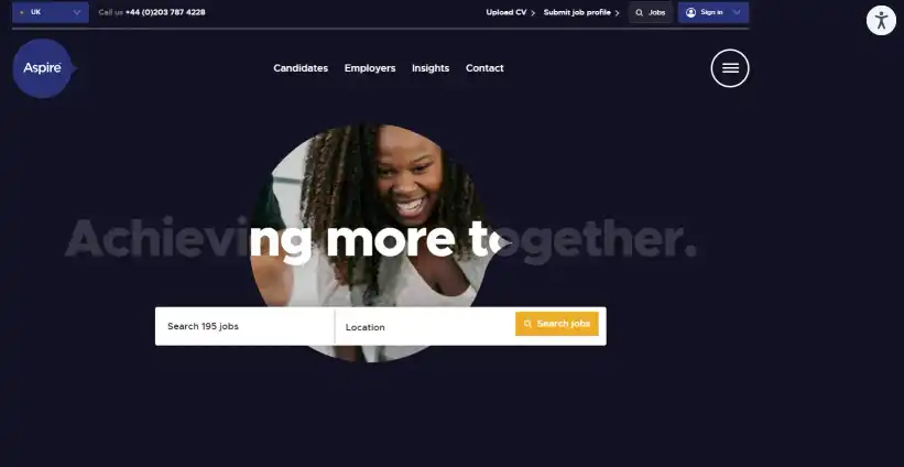
A clever design choice for Aspire’s website was incorporating their logo shape (which looks like a speech bubble) into elements all over the site. From the interactive header to subtle background shapes and graphics, there’s no doubt which agency’s website you’re on.
The website has one unique feature for their specialism subpages: contact cards for consultants which include links to email and LinkedIn profiles. This helps candidates to know exactly who to contact and puts a friendlier, more human face to the agency.
Overall, Aspire’s website has an uncomplicated, easy-to-read design and therefore can be regarded as one of the best recruitment websites for this era. The colour contrast in their theme makes it more accessible to users with visual impairments. They’ve been careful to make their website more inclusive and to add appeal by having their team visible and easy to contact.
Visit Aspire’s website here.
What can I learn for my recruitment site?
Consider new ways to include branding
Include accessibility in your website design
Make contacting consultants easy
7. Major Players
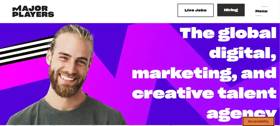
The strength of Major Players’ site is bringing in creative elements without being visually overwhelming. It keeps to two fonts in large letters and uses plenty of white space. For every banner showing photos and bright graphics, there’s enough “blank” to let the eye rest.
The layout of the website works like an inverted triangle. Visitors get a high-impact banner at the top, which slows them down enough to read a mission statement and CTA. This funnel-like design is key to winning over website visitors without pushing them. It offers a slow introduction to the agency with visitors’ most likely questions answered first (e.g., What are the agency’s specialisms? Where are they based? What roles do they offer?).
But for candidates who want to apply right away, there are options. The site has a job search bar right in the middle when the page first loads, so it should be easy to find. There are also buttons at the top of the page again linking to their jobs board and a CTA for clients.
The website’s layout accomplishes two things at once. It gives a wider company overview for visitors who are just browsing. At the same time, it has highly visible links to pull in the “I know what I want” candidates and clients right away.
Visit Major Players’ website here.
What can I apply to my recruitment site?
Balance busy design with visual breaks
Use a “funnel” design to answer visitors’ questions first
Leverage every site element for branding
8. Rutherford Search
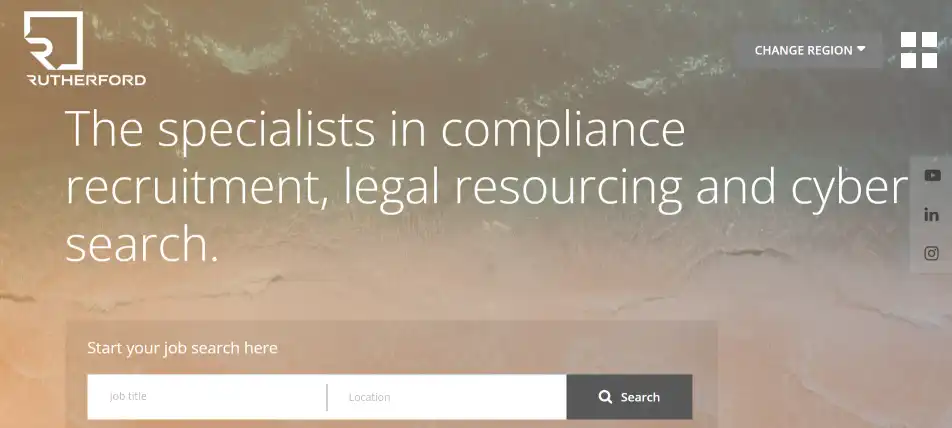
As a Compliance focused search agency based in London and New York, Rutherford Search has made their brand front and centre on their website. With this attractive recruitment website design inspiration has been taken by their brand identity and values without it being overly dominant. For talent considering their next career move, the site has been designed for those with differing needs. From satisfying your desire for the latest compliance blog or for casual job hunting, candidates will have an excellent experience. How the segments are divided help drive the visitor to find out more.
We found the ‘Change region’ a neat feature for those seeking the alternative territory that Rutherford specialises in – New York or London. Switching between region still makes you feel connected to the brand and the transition of the homepage image – on the differing region – made you feel like you were there. We found the ‘About us’ an attractive area to explore further. Each of the team has a photo and profile, which changes colour when you hover on it – so it’s clear who you are looking at and which of the team you are looking to connect with. A neat design element which we applaud. Similarly, if you’re looking for an agency to partner with, information is readily available for hiring managers.
Here is a link to Rutherford Search.
What can I apply to my recruitment site?
Marrying brand identity with ease of navigation
Great use of transition
Easy to see who you are connecting with
Key elements for the best recruitment agency website design
There are a few standout elements that the best recruitment websites have in common. Rather than covering how to post jobs or upload candidate documents, these few points are about how websites can offer the best user experience for any visitor.
Here's a closer look at some of the foundational elements of good web
Smart design elements
For the best website user experience (UX), it helps to think from both the candidates’ and clients’ perspectives.
Good UX for candidates means making it easy to search and apply for jobs. On the other hand, clients might want to know more about your agency and what specialisms you cover.
Maxxima Group’s website can show how these principles work in practice. Their job search function is one of the first things site visitors see, saving potential candidates from clicking around. Clean and effective as soon as you land on the site, for these reasons it’s certainly one of the best recruitment sites. Their front page also offers an overview of the agency, which can give clients or candidates insight into whether they’d like to work with Maxxima.
Whenever a visitor opens your site, the ultimate goal is usually to get them to take action. That’s why we recommend always guiding towards CTAs as early on the page as possible. Invite website visitors to explore subpages, sign up for a newsletter, or contact your agency if they’re ready.
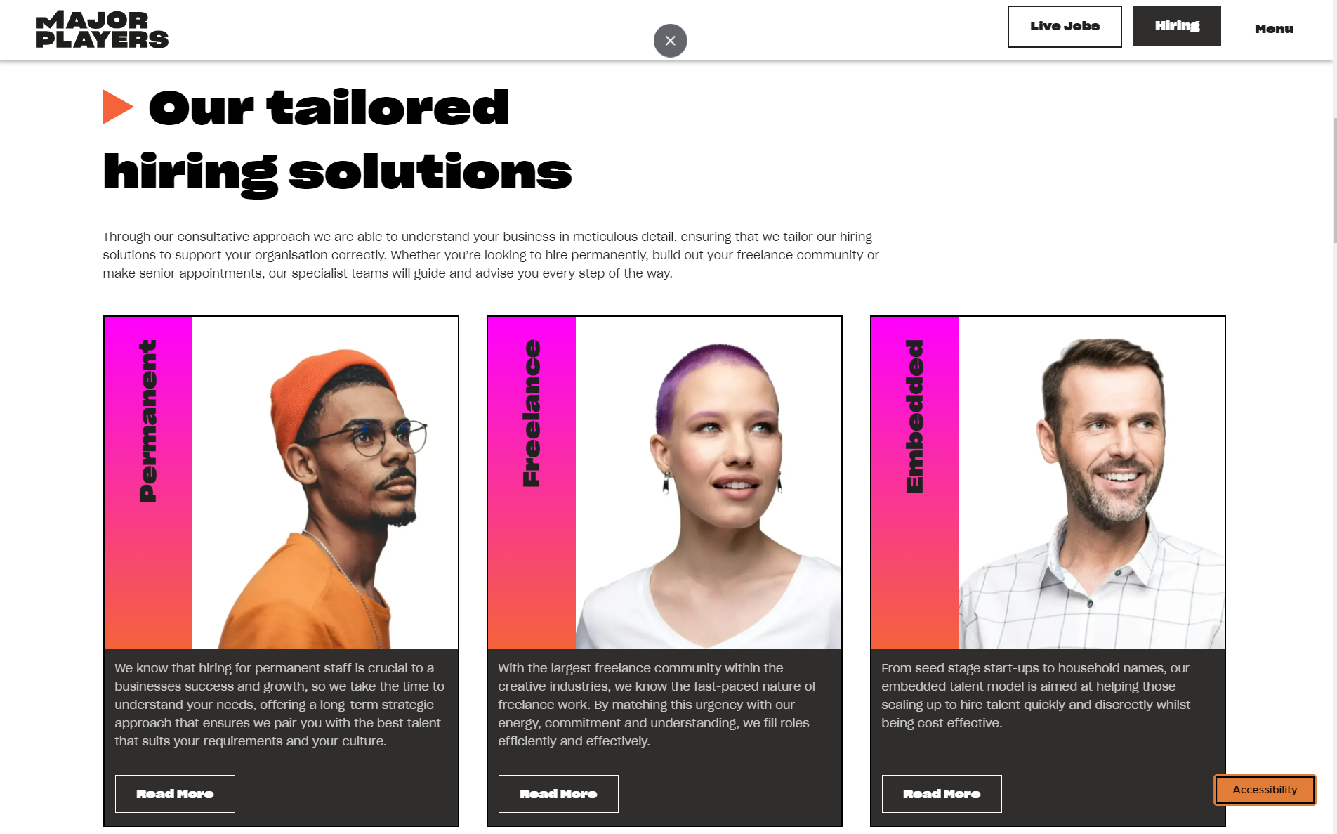
Taking a look at Major Players’ recruitment website, there are CTAs embedded for both candidates and clients. The sub-page or specialism descriptions are simple, the CTA buttons are highly visible, and there are multiple points throughout the visitor’s journey where they could learn more about a service.
Mobile optimisation
Many potential candidates and clients will experience your recruitment website mobile-first. A recent study found that 53% of web traffic came from mobile devices.
With that opportunity in mind, it’s important to plan for mobile optimisation of your website’s design. For an example of mobile-optimised design at work, take a look at Blu Digital’s mobile-friendly recruitment website.
While the website has complex design elements, they’ve been reformatted to fit a vertical screen. They also are laid out in a funnel that leads to several CTAs.
For another good example, consider Sphere Digital Recruitment’s website. On the mobile version, they’ve removed a desktop feature – tabs for candidate and client portals – since it’s not a good fit for the mobile experience.
All of the potentially slow features on the website – like embedded videos and moving graphics – have been formatted to load quickly and ensure that site visitors get the best mobile experience possible.
Accessibility & inclusion
“Accessibility” means using different tools to assist with different needs and abilities. However, there are some general best practices that can help a broad range of site visitors.
Checking colour contrast in website design is one example. If the contrast is too low, text can be difficult to read and exclude visually impaired website visitors – this is a lovely feature not often replicated by others which helps this Australian based recruiter establish itself with a best-in-class recruitment website Chandler Macleod’s website has one example of the right level of contrast in their design.
If you want to test the colour contrast on your own website, consider this Google Chrome extension or a similar tool.
Another important factor to showcase inclusivity is Diversity & Inclusion values. These can be displayed through accessibility in your website’s design, or in a literal way through D&I statements.
Consider showing Diversity & Inclusion values by linking to a D&I page up front like on Aspire’s recruitment website. Their D&I practices are clear, specific and actionable. Aspire show transparency and good faith effort to create a more inclusive recruitment process.
These are just a few samples of how to include accessibility in your recruitment website. To get a broader overview of creating an inclusive candidate experience, read through our guide here.
Next steps
This guide has highlighted some top-performing recruitment agency websites and introduced the elements that could form the basis of your own website’s design. Ready to get started with yours right away? Get in touch today. If you need more time to think, check out our platform tour.
As a recruitment marketer, you’ll want to control costs and attract more candidates through your own website. When you intertwine your own website design and its ability to attract more candidates, this adds agility to your agency’s abilities to attract and place talent with your clients.
You might be interested in:
What is the best website platform for recruitment agencies?
How to build a recruitment website: factors to consider


.png)


